Enoch Cheung
Profile
Business and analytics professional with 5+ years of experience translating digital marketing and product data into decision support through dashboards and performance analysis.
Recently completed an MSc BA (Health) with training in evidence synthesis to analyse how social and digital factors influence adoption and implementation withinin healthcare contexts.
Domain
Digital analytics in health and healthcare contexts
(Interest in prevention and primary care–oriented health solutions)
Skills
Technical: GA4 · GTM · Google Ads · SEO · Search Console · Looker Studio · Tableau
Research: Systematic literature review · Decision-analytic modelling
View My LinkedIn
SERP and SEO
Description: This illustration shows some of the examples I used to evaluate SEO impact on impletmenting pop-up ad. All data is from Search Console only but BigQuery is also being used here. The following examples illustrate some of the practical uses of the data including:
- Evaluate how certain features may impact SEO performance
- Map out movement of Search Rank between dates
- SERP position and volatility
1. Basic ETL
Tools we are using here include BigQuery and Tableau. Search Console does not have its own built-in data transfer to BigQuery, however a python script and Cloud Scheduler could easily fulfill the job without costing you more than a penny. This also allows us to look into SERP data by day hence we can monitor changes in metrics within a given period of time.
2. How Feature A has impacted on the SEO performance over time
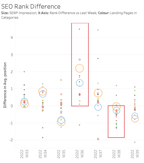
The chart we use here is a scatter plot with date on the x-axis. Position here uses Search Console default explanation therefore a rises in position is a decreases in rank in SERP. The use of differences in positions compared to previous week here illustrates the impact of changes better but it also hinders the ability to show trends.
The implementation of Feature A (a pop-up ad) is at around late W35 and the removal in late W37. There are certainly some other factors affecting the SERP position including natural rises and drops depends on how competitors perform. Fluctuations immediately between weeks however should normally be small, so we’d expect the majority hugging around the 0.
Here we observe rises of SERP positions in nearly all of the page categories in W36, especially the big movers, and the subsequent slight improvement when the ad withdrew.
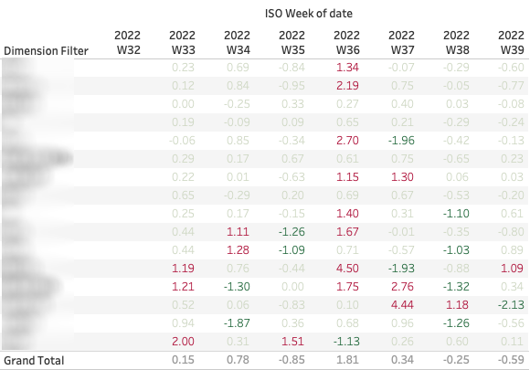 Breaking down in numbers, we see 8 page categories that have more than 1 increase in rank in W36 with an average of 1.81. Most categories have yet to recover from the shock within the observation period.
3. Illustrate how SERP positions change over time for a given dimension
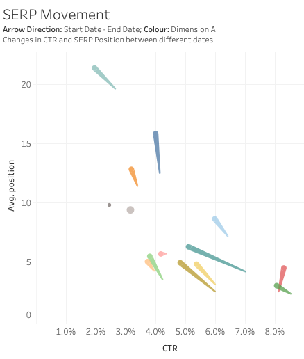
This scatter Plot with movement arrows best illustrates the changes in performance metrics for a given dimension within two static start-end dates. Further examining the pop-up impact, we compare the change of average position and SERP Click-Through Rate between pre-launch and before withdrawal. Choice of CTR neutralises the weight of landing pages and allows us to focus on individual changes. The chart further supports the assumption that pop-up ad hinders SEO performance with the majority resulting a decrease in CTR and rank.
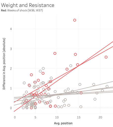
4. Does a higher rank in SERP means higher resistance in shock?
From the above observation we see some of our best performance landing pages held nicer than the others during the shock. We want to see if there is a positive relationship between rank and resistance in major events.
Although not entirely significant, preliminarily we see that during W36 and W37, the weaker landing pages is more prone to decrease in rank.
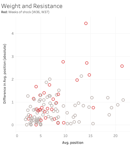
Wrapping up, from the above illustrations, we can conclude that the introduction of pop-up ad did have an impact on SEO. Still, we need further observations on area such as whether the SERP position will restore or whether the conversion rate were affected as well. Charts are quite versatile in working on other areas such as queries instead of landing pages or a longer term SEO monitoring instead of individual events.